Dialog
Open a new window that can be either modal or non-modal and optionally rendered in a React portal. This component is based on the WAI-ARIA Dialog Pattern.
Examples
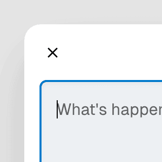
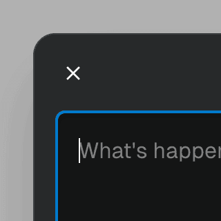
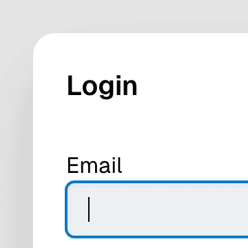
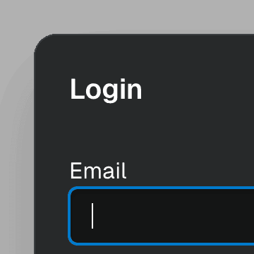
API
Styling
Styling the backdrop
You can style all the backdrop elements using the [data-backdrop] selector:
[data-backdrop] {
background-color: hsl(0 0 0 / 0.1);
}
To style the backdrop of a specific dialog, use the backdrop prop:
Scrollbar width
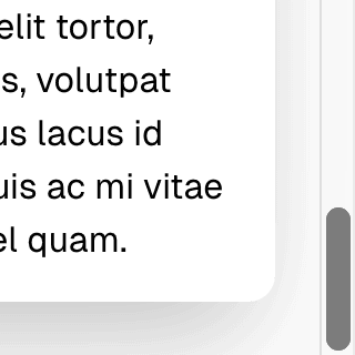
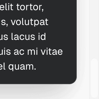
When the preventBodyScroll prop is set to true (default for modal dialogs), the scrollbar will be automatically hidden when the dialog is open. Ariakit keeps the scrollbar's space reserved with the scrollbar-gutter CSS property, so the page layout, including position: fixed elements, doesn't shift. On browsers with classic scrollbars, the reserved space shows the page background while the dialog is open, and fixed elements such as backdrops don't extend over it, just like they don't extend under a visible scrollbar.
When the scrollbar takes up space but scrollbar-gutter isn't supported (such as Safari before 18.2), Ariakit falls back to padding the body element and defines a --scrollbar-width CSS variable instead. If you need to support these browsers and your page contains position: fixed elements, you can apply this variable with a 0px fallback to adjust their padding-right:
.header {
padding-right: calc(16px + var(--scrollbar-width, 0px));
}
Z-index
Modal dialogs are rendered at the end of the document using React Portal, which means they will be rendered on top of all other elements by default.
However, if you set the portal prop to false or use the z-index property on other elements, you might need to adjust the z-index of the dialog:
.dialog {
z-index: 100;
}
For more information on styling with Ariakit, refer to the Styling guide.