All things Form controls
Components
ButtonTrigger an action or event, such as submitting a Form, opening a Dialog, canceling an action, or performing a delete operation in React. This component is based on the WAI-ARIA Button Pattern.
CheckboxSelect one or more options in a list or toggle a single option using a native or custom checkbox in React. This component is based on the WAI-ARIA Checkbox Pattern.
ComboboxFill in a React input field with autocomplete & autosuggest functionalities. Choose from a list of suggested values with full keyboard support. This component is based on the WAI-ARIA Combobox Pattern.
FormSubmit information with accessible interactive controls in React. Take advantage of the browser's built-in validation with screen reader support. This component is based on the WAI-ARIA Form Role.
RadioChoose one option from a list of choices presented as radio buttons. This component is based on the WAI-ARIA Radio Group Pattern.
SelectSelect a value from a list of options presented in a dropdown menu, similar to the native HTML select element. This component is based on the WAI-ARIA Combobox Pattern.
Examples


Checkbox as buttonRendering a custom Checkbox as a button element in React, while keeping it accessible to screen reader and keyboard users.
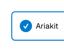

Custom CheckboxRendering a visually hidden Checkbox using the VisuallyHidden component to show a custom checkbox presentation in React.
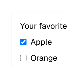
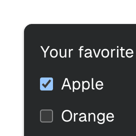
Checkbox groupRendering multiple Checkbox elements in React to form a group of checkboxes. The selected values are stored in an array provided by the CheckboxProvider component.
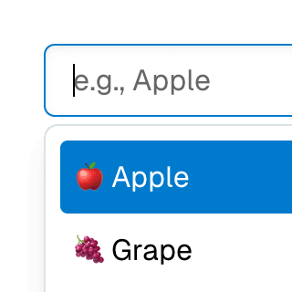
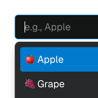
Animated ComboboxAnimating a Combobox using CSS transitions in React. The component waits for the transition to finish before completely hiding the popover.

ComboboxCancelReseting the value of a Combobox with a button rendered next to it using the ComboboxCancel component.

ComboboxDisclosureOpening and closing a Combobox with the help of a button rendered next to it using the ComboboxDisclosure component.
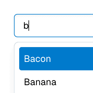
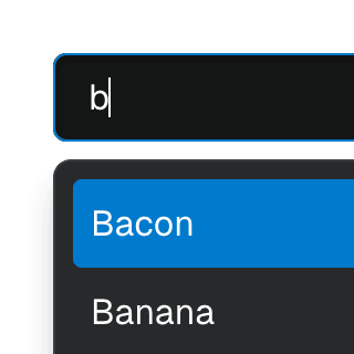
Combobox filteringListing suggestions in a Combobox component based on the input value using React.startTransition to ensure the UI remains responsive during typing.
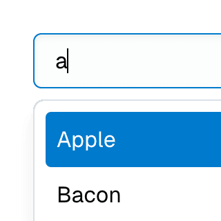
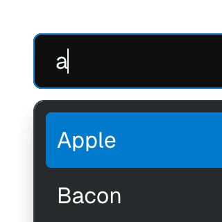
Combobox with integrated filterFiltering options in a Combobox component through an abstracted implementation using React.useDeferredValue, resulting in a simple higher-level API.
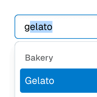
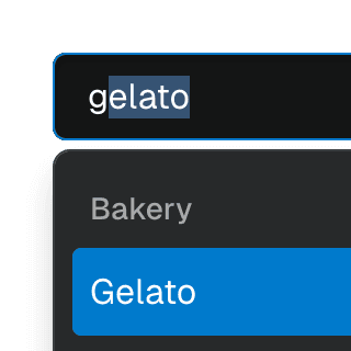
ComboboxGroupOrganizing Combobox items into labelled groups using the ComboboxGroup and ComboboxGroupLabel components in React.


Combobox with linksUsing a Combobox with items rendered as links that can be clicked with keyboard and mouse. This is useful for creating an accessible page search input in React.
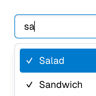
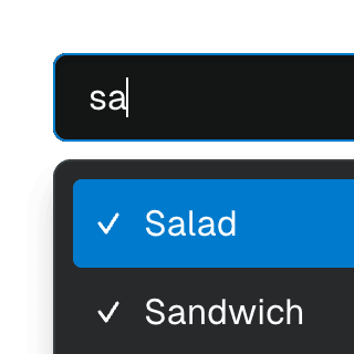
Multi-selectable ComboboxAllowing Combobox to select multiple options by passing an array value to the selectedValue prop.
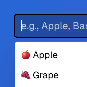
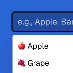
Radix ComboboxUsing just the necessary Ariakit components to build a Combobox with Radix UI. For projects already using Radix UI and looking for autocomplete, autosuggest and search features.
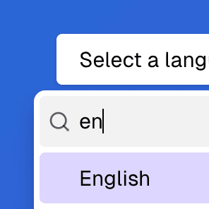
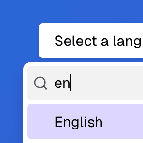
Radix Select with ComboboxRendering a searchable Radix UI Select component with a text field that enables typeahead & autocomplete features using the primitive Ariakit Combobox components.
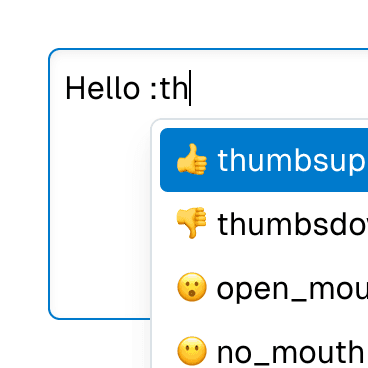
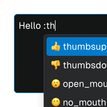
Textarea with inline ComboboxRendering Combobox as a textarea element to create an accessible multiline textbox in React. Inserting specific characters triggers a popup with dynamic suggestions.
FormRadioUsing the FormRadioGroup and FormRadio components to create a Form with custom validation that requires a user to select an option from a list of radio buttons.
Form with SelectCombining Form and Combobox to create an accessible custom select widget that works with the browser's built-in validation and native form submission.
Animated SelectAnimating a Combobox select using CSS transitions in React. The component waits for the transition to finish before completely hiding the popover.
Searchable Combobox SelectCombining ComboboxSelect and ComboboxInput in the same Combobox provider to create a dropdown with a search field that filters its items.
Combobox Select with TabsAbstracting Combobox and Tab components into a searchable, tabbed select dropdown.
Select gridUsing Combobox with ComboboxPopover rendered with the grid role to create a bidimensional list of selectable items.
Select groupSeparating Combobox items into groups using the ComboboxGroup and ComboboxGroupLabel components.
Select with custom itemsRendering a Combobox select with a custom styled value and ComboboxItem's children.
Multi-selectable Combobox SelectAllowing the Combobox component to select multiple values by passing an array to the selectedValue prop on the ComboboxProvider component.