Combobox
Fill in a React input field with autocomplete & autosuggest functionalities. Choose from a list of suggested values with full keyboard support. This component is based on the WAI-ARIA Combobox Pattern.
Examples
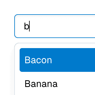
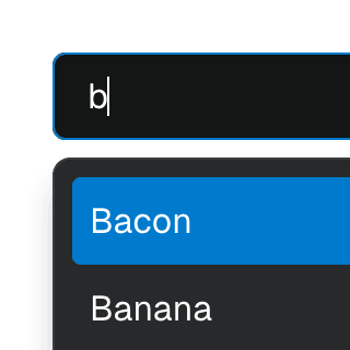
Combobox filteringListing suggestions in a Combobox component based on the input value using React.startTransition to ensure the UI remains responsive during typing.
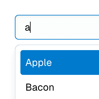
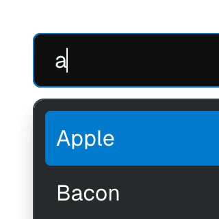
Combobox with integrated filterFiltering options in a Combobox component through an abstracted implementation using React.useDeferredValue, resulting in a simple higher-level API.
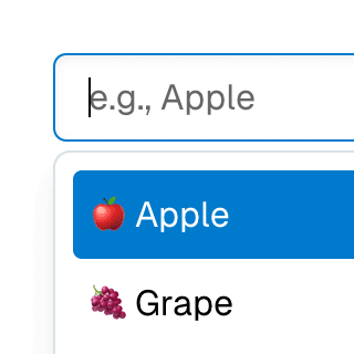
Animated ComboboxAnimating a Combobox using CSS transitions in React. The component waits for the transition to finish before completely hiding the popover.
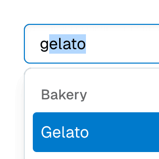
ComboboxGroupOrganizing Combobox items into labelled groups using the ComboboxGroup and ComboboxGroupLabel components in React.

ComboboxDisclosureOpening and closing a Combobox with the help of a button rendered next to it using the ComboboxDisclosure component.


Combobox with linksUsing a Combobox with items rendered as links that can be clicked with keyboard and mouse. This is useful for creating an accessible page search input in React.
Multi-selectable Combobox SelectAllowing the Combobox component to select multiple values by passing an array to the selectedValue prop on the ComboboxProvider component.
Animated SelectAnimating a Combobox select using CSS transitions in React. The component waits for the transition to finish before completely hiding the popover.
Searchable Combobox SelectCombining ComboboxSelect and ComboboxInput in the same Combobox provider to create a dropdown with a search field that filters its items.
Combobox Select with TabsAbstracting Combobox and Tab components into a searchable, tabbed select dropdown.
Combobox Select with Next.js App RouterControlling the selected value of a Combobox via the URL using the Next.js App Router and React.useOptimistic to ensure a responsive and accessible UI.
Select gridUsing Combobox with ComboboxPopover rendered with the grid role to create a bidimensional list of selectable items.
Select groupSeparating Combobox items into groups using the ComboboxGroup and ComboboxGroupLabel components.
Select with custom itemsRendering a Combobox select with a custom styled value and ComboboxItem's children.
Form with SelectCombining Form and Combobox to create an accessible custom select widget that works with the browser's built-in validation and native form submission.
Toolbar with SelectRendering ComboboxSelect as a ToolbarItem inside a Toolbar.
API
Styling
Styling the active item
When browsing the list with a keyboard (or hovering over items with the mouse when the focusOnHover prop is true), the active item element will have a data-active-item attribute. You can use this attribute to style the active item:
.combobox-item[data-active-item] {
background-color: hsl(204 100% 40%);
color: white;
}
Learn more on the Styling guide.