ComboboxProvider
Provides a combobox store that controls the state of Combobox components.
Code examples
Optional Props
activeId
string | null | undefined
The current active item id. The active item is the element within the
composite widget that has either DOM or virtual focus (in case
virtualFocus
is enabled).
nullrepresents the composite element (the one with a composite role). Users will be able to navigate out of it using arrow keys.If
activeIdis initially set tonull, thecompositeElementInFocusOrderprop will also default totrue, which means the composite element itself will have focus and users will be able to navigate to it using arrow keys.
Live examples
compositeElementInFocusOrder
boolean
Defaults to true, or false when a
ComboboxSelect is
rendered.
defaultActiveId
string | null | undefined = null
The composite item id that should be active by default when the composite
widget is rendered. If null, the composite element itself will have focus
and users will be able to navigate to it using arrow keys. If undefined,
the first enabled item will be focused.
defaultInputValue
string | undefined = ""
The initial value of the combobox input.
defaultItems
T[] | undefined = []
The default value for the
items state.
defaultOpen
boolean | undefined = false
Whether the content should be visible by default.
defaultSelectedValue
MutableValue<T> | undefined
The initial value of the
selectedValue
state. This can be a string or an array of strings. If it's an array, the
combobox is considered
multi-selectable.
The default value is "" for a plain combobox. When a
ComboboxSelect is
rendered, the first enabled item with a defined value is selected instead.
Pass "" explicitly to prevent this automatic selection.
Live examples
disclosure
DisclosureStore | null | undefined
A reference to another disclosure store that controls another disclosure
component to keep them in sync. Element states like contentElement and
disclosureElement won't be synced. For that, use the
store prop
instead.
Live examples

focusLoop
boolean | Orientation
Defaults to true, or false when a
ComboboxSelect is
rendered.
focusShift
boolean = false
Works only on two-dimensional composite widgets.
If enabled, moving up or down when there's no next item or when the next item is disabled will shift to the item right before it.
Live examples
focusWrap
boolean | Orientation
Defaults to true, or false when a
ComboboxSelect is
rendered.
id
string
The ID of the composite store is used to reference elements within the composite widget before hydration. If not provided, a random ID will be generated.
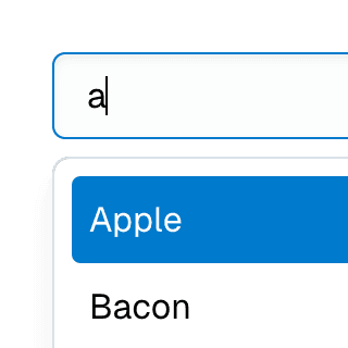
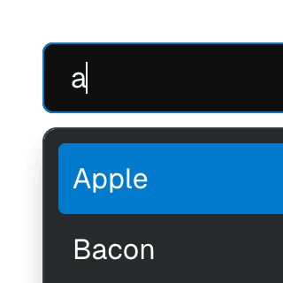
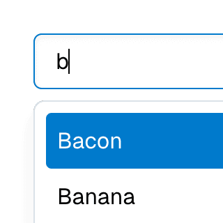
inputValue
string
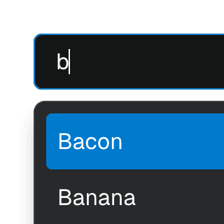
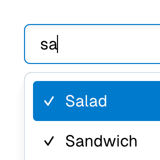
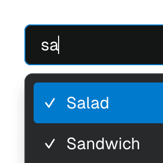
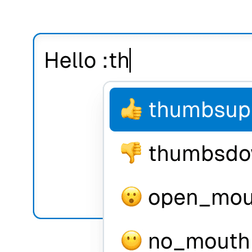
The combobox input value.
Live examples


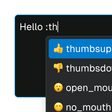
items
T[]
Lists all items along with their metadata. This state is automatically
updated when an item is registered or unregistered using the
registerItem
function.
Live examples
open
boolean = false
Whether the content is visible.
Live examples
orientation
Orientation = "vertical"
Defines the orientation of the composite widget. If the composite has a
single row or column (one-dimensional), the orientation value determines
which arrow keys can be used to move focus:
both: all arrow keys work.horizontal: only left and right arrow keys work.vertical: only up and down arrow keys work.
It doesn't have any effect on two-dimensional composites.
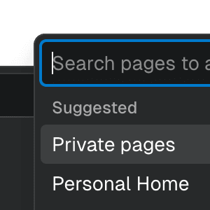
placement
Placement = "bottom"
The placement of the popover.
Live examples

popover
PopoverStore | null | undefined
A reference to another popover store that's controlling another popover to keep them in sync.
resetValueOnHide
boolean
Whether to reset the value when the combobox popover closes. This prop is
automatically set to true by default if the combobox supports multiple
selections. In other words, if the
selectedValue
or
defaultSelectedValue
props are arrays. However, when the combobox is connected to a
tag store, the
default is false so the input value is kept when the popover closes.
Live examples
rtl
boolean = false
Determines how the
next and
previous
functions will behave. If rtl is set to true, they will be inverted.
This only affects the composite widget behavior. You still need to set
dir="rtl" on HTML/CSS.
selectedValue
MutableValue<T>
The value(s) of the currently selected item(s). This can be a string or an array of strings. If it's an array, the combobox is considered multi-selectable.
Live examples
selectOnMove
boolean = false
Whether the combobox
selectedValue
should be set when the active item changes by moving while
ComboboxSelect is open.
The selected value is always updated when moving while the select is
closed.
Live examples
setActiveId
((activeId: string | null | undefined) => void) | undefined
A callback that gets called when the
activeId
state changes.
setInputValue
((value: string) => void) | undefined
A callback that gets called when the
inputValue
state changes.
Live examples
setItems
BivariantCallback<(items: T[]) => void> | undefined
A callback that gets called when the
items state
changes.
Code examples
const [items, setItems] = useState([]);
setMounted
((mounted: boolean) => void) | undefined
A callback that gets called when the mounted state changes.
Code examples
const [mounted, setMounted] = useState(false);
setOpen
((open: boolean) => void) | undefined
A callback that gets called when the
open state
changes.
Code examples
const [open, setOpen] = useState(false);
setSelectedValue
BivariantCallback<(value: MutableValue<T>) => void> | undefined
A callback that's invoked when the
selectedValue
state changes, typically when the user selects an item. This can be used to
implement behavior like onSelect or onItemSelect.
Live examples
store
Store<Partial<S>> | undefined
Another store object that will be kept in sync with the original store.
Live examples
tag
TagStore | null | undefined
A reference to a tag store. It's automatically set when rendering a combobox within a tag list.
virtualFocus
boolean = true
If enabled, the composite element will act as an aria-activedescendant container instead of roving tabindex. DOM focus will remain on the composite element while its items receive virtual focus.
In both scenarios, the item in focus will carry the
data-active-item
attribute.
Live examples
animated
animatednumber | boolean | undefined
Deprecated: Manually setting the animated prop is no longer necessary.
This will be removed in a future release.
Determines whether the content should animate when it is shown or hidden.
If
true, theanimatingstate will betruewhen the content is shown or hidden and it will wait for a CSS animation/transition to end before becomingfalse.If it's set to a number, the
animatingstate will betruewhen the content is shown or hidden and it will wait for the number of milliseconds to pass before becomingfalse.
defaultValue
defaultValuestring | undefined = ""
Deprecated: Use
defaultInputValue
instead.
The initial value of the combobox input.
includesBaseElement
includesBaseElementboolean
Deprecated: Use
compositeElementInFocusOrder
instead.
Whether the composite element is in the arrow-key focus order.
resetValueOnSelect
resetValueOnSelectboolean
Deprecated: Use the
resetValueOnSelect
prop on ComboboxItem
instead.
Whether to reset the value when an item is selected. This prop is
automatically set to true by default if the combobox supports multiple
selections. In other words, if the
selectedValue
or
defaultSelectedValue
props are arrays.
setValue
setValue((value: string) => void) | undefined
Deprecated: Use
setInputValue
instead.
A callback that gets called when the
inputValue
state changes.
value
valuestring
Deprecated: Use
inputValue
instead.
The combobox input value.