All things Combobox
Components
Examples
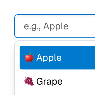
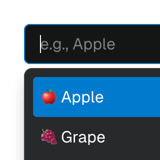
Animated ComboboxAnimating a Combobox using CSS transitions in React. The component waits for the transition to finish before completely hiding the popover.

ComboboxCancelReseting the value of a Combobox with a button rendered next to it using the ComboboxCancel component.

ComboboxDisclosureOpening and closing a Combobox with the help of a button rendered next to it using the ComboboxDisclosure component.
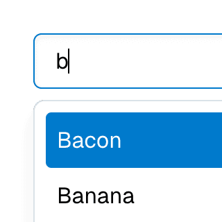
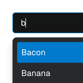
Combobox filteringListing suggestions in a Combobox component based on the input value using React.startTransition to ensure the UI remains responsive during typing.
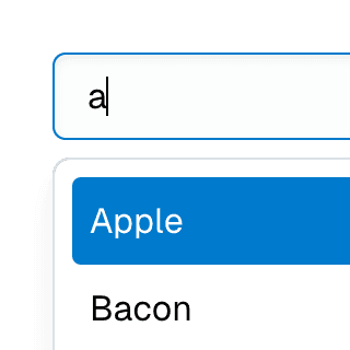
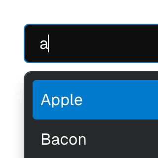
Combobox with integrated filterFiltering options in a Combobox component through an abstracted implementation using React.useDeferredValue, resulting in a simple higher-level API.
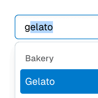
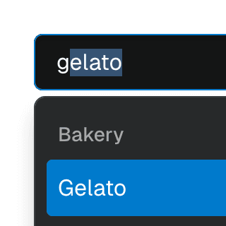
ComboboxGroupOrganizing Combobox items into labelled groups using the ComboboxGroup and ComboboxGroupLabel components in React.


Combobox with linksUsing a Combobox with items rendered as links that can be clicked with keyboard and mouse. This is useful for creating an accessible page search input in React.
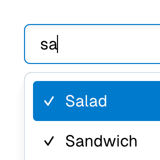
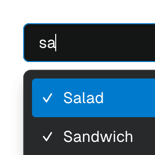
Multi-selectable ComboboxAllowing Combobox to select multiple options by passing an array value to the selectedValue prop.
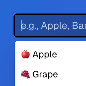
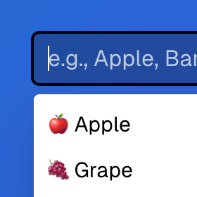
Radix ComboboxUsing just the necessary Ariakit components to build a Combobox with Radix UI. For projects already using Radix UI and looking for autocomplete, autosuggest and search features.
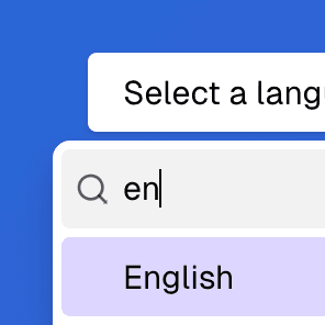
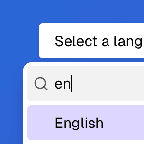
Radix Select with ComboboxRendering a searchable Radix UI Select component with a text field that enables typeahead & autocomplete features using the primitive Ariakit Combobox components.
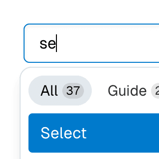
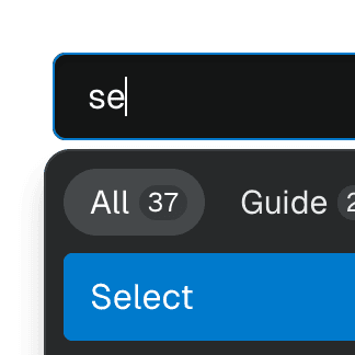
Combobox with TabsOrganizing Combobox with Tab components that support mouse, keyboard, and screen reader interactions. The UI remains responsive by using React.startTransition.

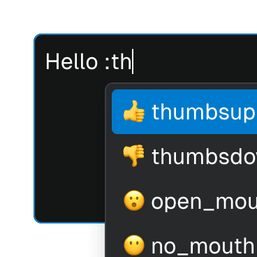
Textarea with inline ComboboxRendering Combobox as a textarea element to create an accessible multiline textbox in React. Inserting specific characters triggers a popup with dynamic suggestions.


Command MenuCombining Dialog and Combobox to enable users to search a command list in a Raycast-style modal.
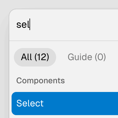
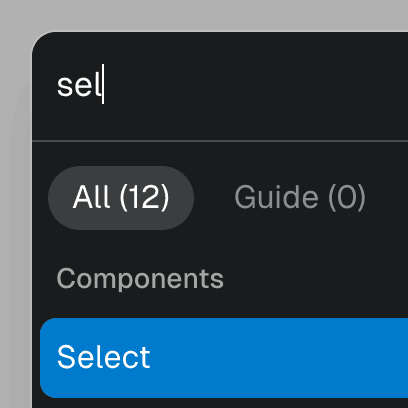
Command Menu with TabsCombining Dialog, Tab, and Combobox from Ariakit React to build a command palette component.
Form with SelectCombining Form and Combobox to create an accessible custom select widget that works with the browser's built-in validation and native form submission.
Menu with ComboboxCombining Menu and Combobox to create a dropdown menu with a search field that can be used to filter menu items.


Submenu with ComboboxNesting Notion-style dropdown menus with search & autocomplete features by combining Menu with Combobox.
Animated SelectAnimating a Combobox select using CSS transitions in React. The component waits for the transition to finish before completely hiding the popover.
Searchable Combobox SelectCombining ComboboxSelect and ComboboxInput in the same Combobox provider to create a dropdown with a search field that filters its items.
Combobox Select with TabsAbstracting Combobox and Tab components into a searchable, tabbed select dropdown.
Select gridUsing Combobox with ComboboxPopover rendered with the grid role to create a bidimensional list of selectable items.
Select groupSeparating Combobox items into groups using the ComboboxGroup and ComboboxGroupLabel components.
Select with custom itemsRendering a Combobox select with a custom styled value and ComboboxItem's children.
Multi-selectable Combobox SelectAllowing the Combobox component to select multiple values by passing an array to the selectedValue prop on the ComboboxProvider component.
Toolbar with SelectRendering ComboboxSelect as a ToolbarItem inside a Toolbar.
Combobox Select with Next.js App RouterControlling the selected value of a Combobox via the URL using the Next.js App Router and React.useOptimistic to ensure a responsive and accessible UI.
API Reference
useComboboxStoreCreates a combobox store to control the state of
Combobox components.
useComboboxContextReturns the combobox store from the nearest combobox container.
ComboboxAlias: ComboboxInput
ComboboxAnchorRenders an element that acts as the anchor for the
ComboboxPopover
component.
ComboboxCancelRenders a combobox cancel button that clears the combobox input value when
clicked.
ComboboxDisclosureRenders a combobox disclosure button that toggles the
ComboboxPopover element's
visibility when clicked.
ComboboxDismissRenders a button that hides a
ComboboxPopover component
when clicked.
ComboboxGroupRenders a group for
ComboboxItem elements.
Optionally, a
ComboboxGroupLabel
can be rendered as a child to provide a label for the group.
ComboboxGroupLabelRenders a label in a combobox group. This component should be wrapped with
ComboboxGroup so the
aria-labelledby is correctly set on the group element.
ComboboxHeadingRenders a heading element that labels
ComboboxPopover and
ComboboxList components.
ComboboxInputAlias: Combobox
ComboboxInputValueRenders the current
inputValue
state in the
combobox store.
ComboboxItemRenders a combobox item inside
ComboboxList or
ComboboxPopover
components.
ComboboxItemCheckRenders a checkmark icon when the
checked prop
is true. The icon can be overridden by providing a different one as
children.
ComboboxItemSelectedExposes whether the closest
ComboboxItem is selected
through a function child.
ComboboxItemValueRenders a span element with the combobox item value as children. The value
is split into span elements. Portions of the value matching the user input
will have a
data-user-value
attribute, while the rest will have a
data-autocomplete-value
attribute.
ComboboxLabelRenders a label for the Combobox
component.
ComboboxListRenders a combobox list. The role prop is set to listbox by default, but
can be overriden by any other valid combobox popup role (listbox, menu,
tree, grid or dialog).
ComboboxPopoverRenders a combobox popover. The role prop is set to listbox by default,
but can be overriden by any other valid combobox popup role (listbox,
menu, tree, grid or dialog).
ComboboxProviderProvides a combobox store that controls the state of
Combobox components.
ComboboxRowRenders a combobox row that allows two-dimensional arrow key navigation.
ComboboxItem elements
wrapped within this component will automatically receive a
rowId prop.
ComboboxSelectRenders a custom select element that controls the visibility of a
ComboboxList or
ComboboxPopover.
ComboboxSelectArrowRenders an arrow pointing to the combobox popover position.
ComboboxSelectedValueRenders the current
selectedValue
state in the combobox store.
ComboboxSelectLabelRenders a label for the
ComboboxSelect component.
Clicking the label moves focus to the select element.
ComboboxSeparatorDeprecated: Use
ComboboxGroup with CSS
borders instead.
ComboboxValueDeprecated: Use
ComboboxInputValue
instead.